Building a travel or booking website? Me too! Here are some UX tips I’ve put together to remind myself to plan and navigate the challenges of engaging users in our always-on, always mobile and always competitive world.
1. You’ve Got 3 Seconds – Design a Kickass UX
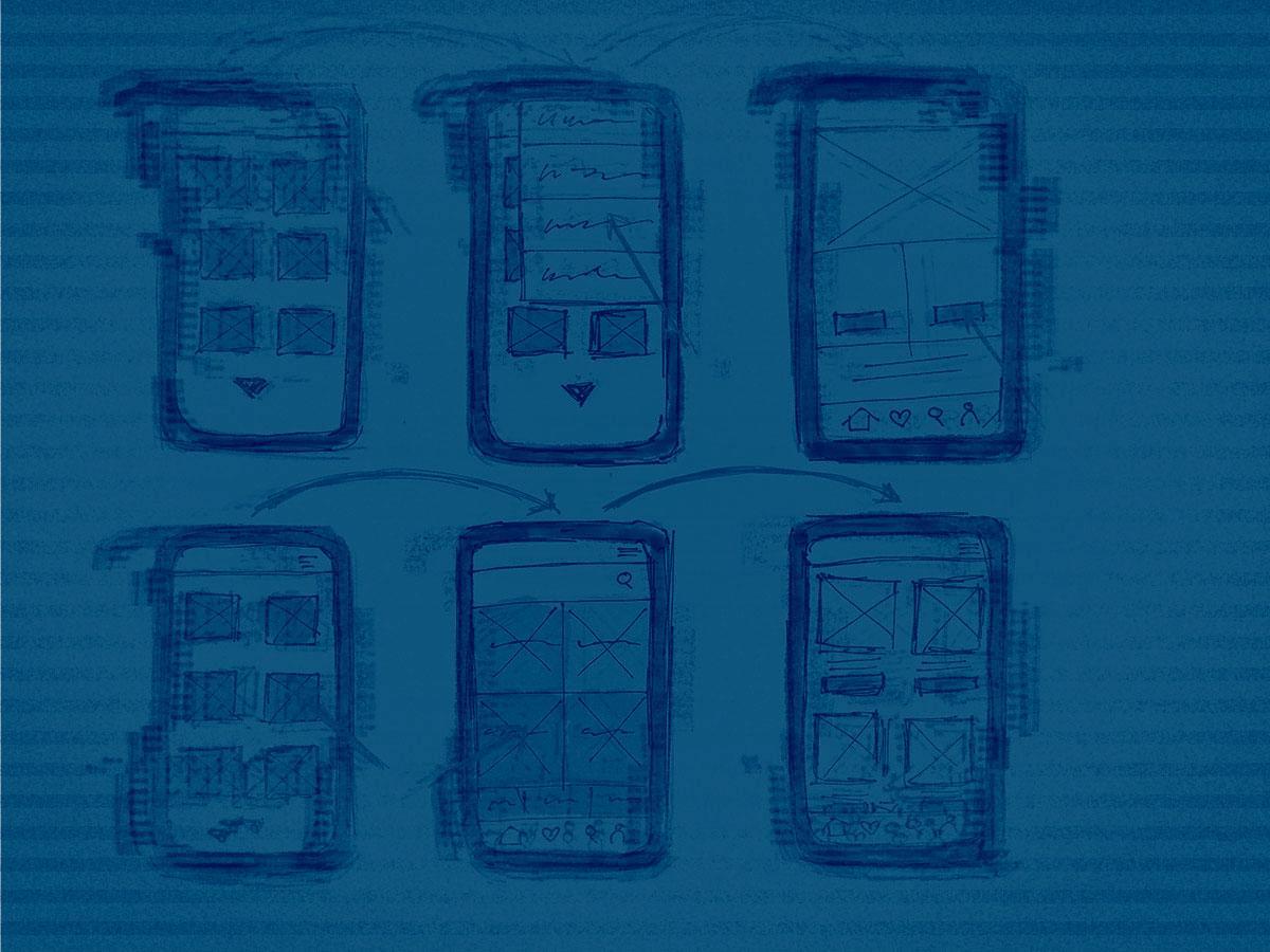
Create Clear Empty States & User Onboarding
I’ve always used the three second rule when designing UX onboarding… but recently my co-workers taught me a line from Pitch Perfect 2 (I’m a dude, so no, I haven’t seen it): “My time is like a toddler in a tiara – precious and short.” So now, I chant this to myself when I start a new UX. In other, more businessy terms, you’ve got a very short time to engage your users during their first interaction, so make sure to set expectations up front for a great experience so they keep coming back. Put on your nanny hat and lead your users down an easy path to complete the tasks you want them to, then move them on to the next step. It’s not that your audience is stupid, it’s that they are conditioned to expect immediate gratification and if you don’t give it to them, you’ll lose them for good. In a nutshell, keep it visually simple and intuitive, educate your users, make sure to prompt action and introduce success states.
2. Keep it Simple
Avoid Information Overload: Landing Page / Reservation Widget
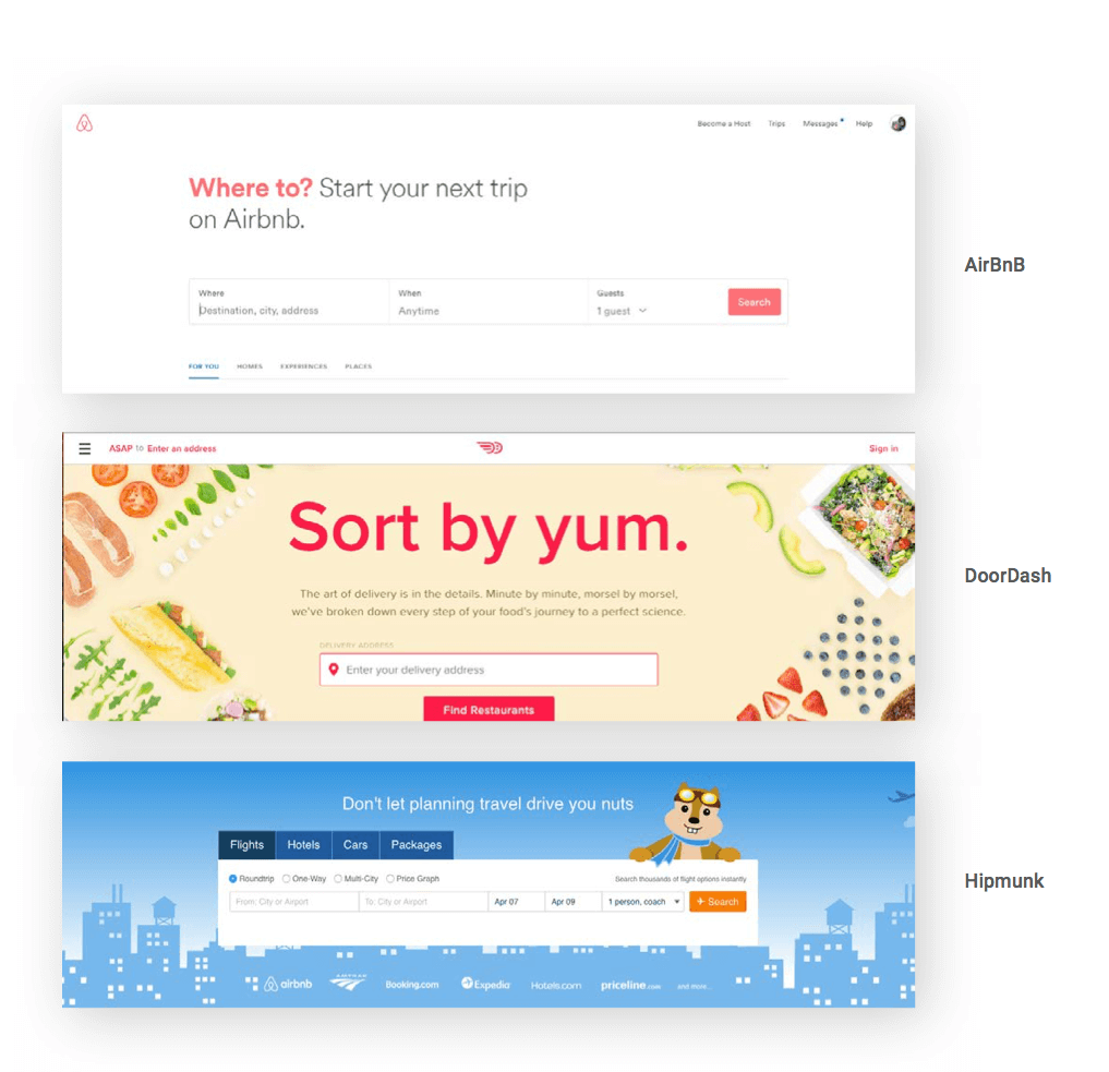
And on that note, I’ll keep this section simple. Just make sure to simplify navigation and search, use reassuring language and make the extra stuff easy to skip.
3. The More Data Fields, The Less Data You’ll Get
Keep Your Forms Simple and Friendly
Don’t get greedy. The more fields you add, the more drop off you’ll get, and then you’ll have nothing. Nada data. Don’t burden your users with extra data fields just because your research team wants more data. If it’s not pertinent to the booking request or process, don’t ask it. And NEVER, EVER ask users to register and/or login in order to make a booking unless you have something to give them…an offer or some kind of advantage is a must if you go down this road.
4. You Want Them to Find Your Discount Code
Put Your Discount Code Up Front – Don’t Play Hide and Seek
Discount codes are great (and frankly these days, expected), but they’ll work against you if your user can’t find it or use it. A well-placed discount code will actually prompt your travelers to move forward. It’s like having that treasure and wanting to cash it in. Exactly how prominent are codes today? I just Googled “airport parking” and my fourth organic result was “airport parking reservations coupon code”. If your UX is unwieldy, it’s a major blow to the flow at checkout – adding extra time and stress on the traveler who is now anxious to cash in on that discount before it expires. You need to keep them engaged, because if they get distracted, you lose your chance to get that booking.
5. Make Your Calendar Work FOR You… Not AGAINST You
Make your booking calendar easy to use… and really dynamic
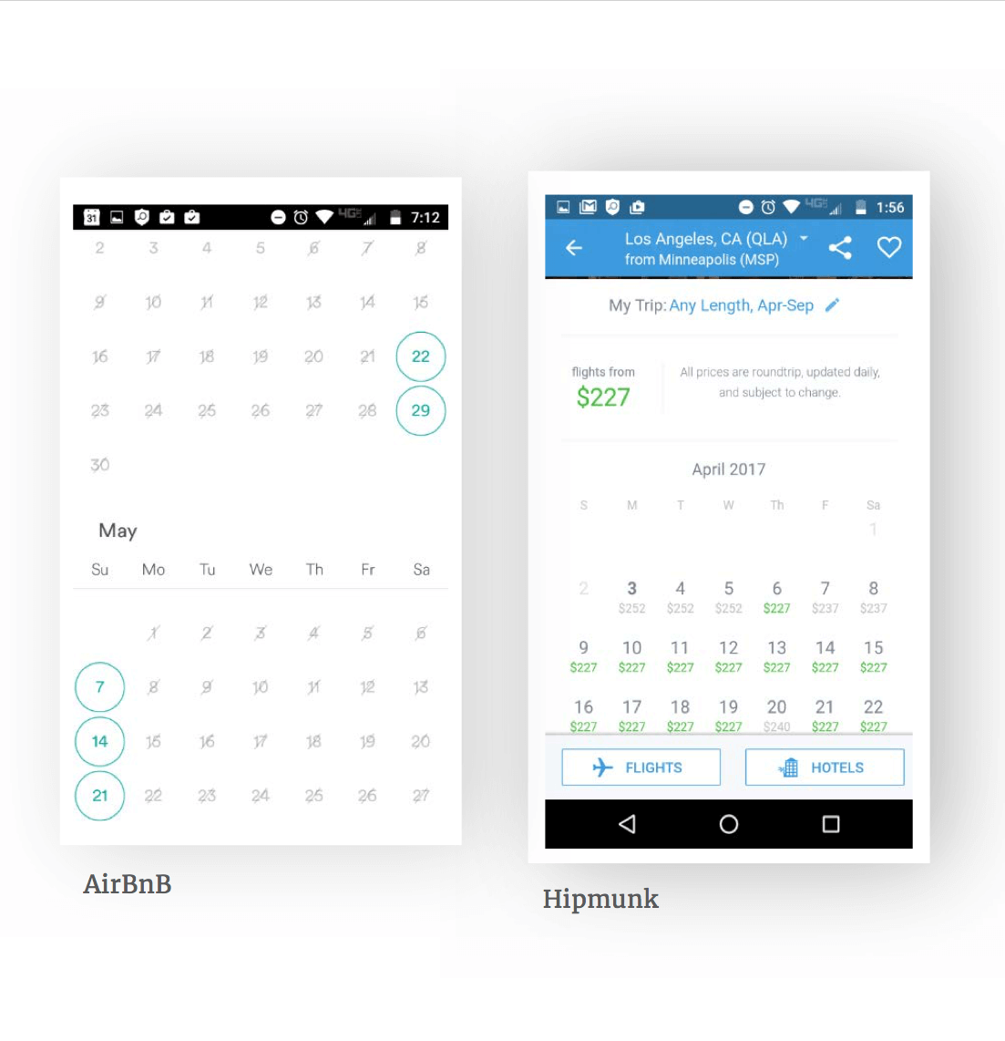
Right away, work to exceed expectations on your calendar usability. Find one you really love to use, and aim to make one that’s even better. It’s one of the first things your users will do, so it better be easy and intuitive or you’ll lose them. By intuitive, I mean give them as much as possible before they even start, like filling in the check-in and check-out fields with the current date, plus a day… and when they select a check-in date, the check-out date field should change accordingly and mark all previous dates as unavailable. To simplify your life, use smart calendars, date filters and date choosers/pickers… and test it with your friends and colleagues to make sure it’s totally intuitive.
6. Keep Your Rates up to Date
Provide Accurate, Comprehensible Rate Information
The rub with transactional websites like the parking website I’m working on, is that services usually have several different rates for the same time period, and even for the same category. It’s really a challenge to design an easy, comprehensive and comprehensible rate information section.
Make sure to clearly highlight the rate differences and extra charges that may apply, while also removing the clutter and avoiding tiny font copy to explain the rates.
7. Reward Them Along the Way
Optimize the Booking Progress Bar
Users want to be in control… of everything. Give them that control and they’ll be much happier campers. If your process is lengthy, it’s a good idea to split it into a few steps – even if there are only two or three, it makes the whole thing more digestible and they feel like they’re getting little trophies along the way. Showing the process removes the “anxiety of the unknown” – in this case, the time and effort it will take to book on your site.
The key is to show users how close they are to accomplishing their goal with a simple progress bar, which will also encourage them to move forward and complete the process.
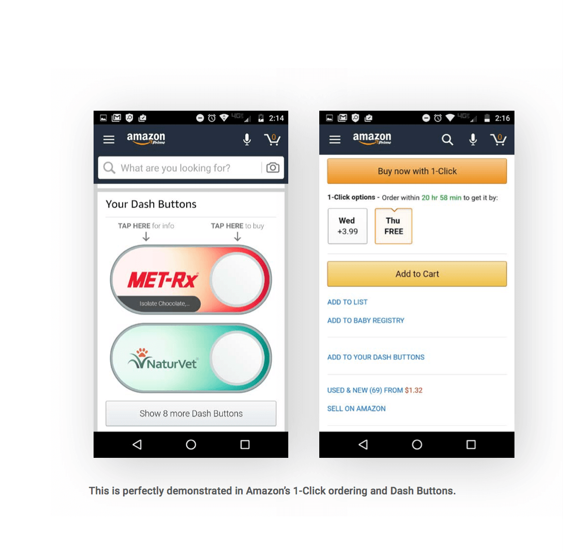
8. You’ve got ‘em There, Now Upsell and Cross-sell
Create a Win-Win Situation
Users love suggestions on other stuff to buy. Just look at Amazon if you don’t believe me. Upselling and cross-selling can and should be used to ‘help customers win’ and give them suggestions on stuff they may not have thought about. These should be friendly suggestions – like “we thought you’d be interested in…” or “hey, look what else we found for you…”
Some helpful tips: When you’re doing this, make sure to “bundle” so you can make their decision easier. It’s also courteous to make sure the upsells are not more than 25% costlier than the original products. You also can pre-select the add-on features and then ask them to deselect if they want. Customer personas can also help make relevant suggestions, and context also helps – “why you should buy this instead of that”.
9. You Have One Chance to be Credible
Building Credibility and Trust is Paramount
So, if you’re a travel website, you’ve got to compete with the likes of established booking sites like Expedia. If you want to stand a chance, you must attain credibility in the eyes of the user – and that’s best done with some security badges and icons that say “I’m a credible website so you can book here safely! Your credit card information will be safe and your booking will be valid”. But that’s a lot to say with words, so say it with icons instead.
Prove your credibility to the user with security badges and icons that he/she is familiar with. Examples: Verified by Visa or Mastercard SecureCode , McAfee Secure, Symantec.
10. Eliminate the Pain Point of Reordering
Reduce Friction Within the Process
In UX terms, “friction” is used to describe those sticky moments and potential pain points that crop up when using a site. More often than not, consumers will just abandon ship when a site becomes too frustrating. You’ll need to come up with some innovative and creative solutions to lessen these points of friction to give your users a smooth, hassle-free experience.
So that’s it for now. I’ll keep talking about UX and design in future blogs, but this topic is so relevant for me right now I wanted to get it out there. Thanks for reading!