This is part one of a three-part series on how we build cohesive and compelling campaigns at Modern Impact.
PART ONE: Email Campaign Design
Say you’re a hot sauce company looking to tell your target audience about a new product you’ve just developed. The new product needs to speak to your overall branding, but also needs its own voice. In this post, I’ll be going through how we create our branded email campaigns here at ModernImpact.
After the Creative Brief (which tells us everything we need to know), our process goes like this:
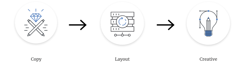
Copy
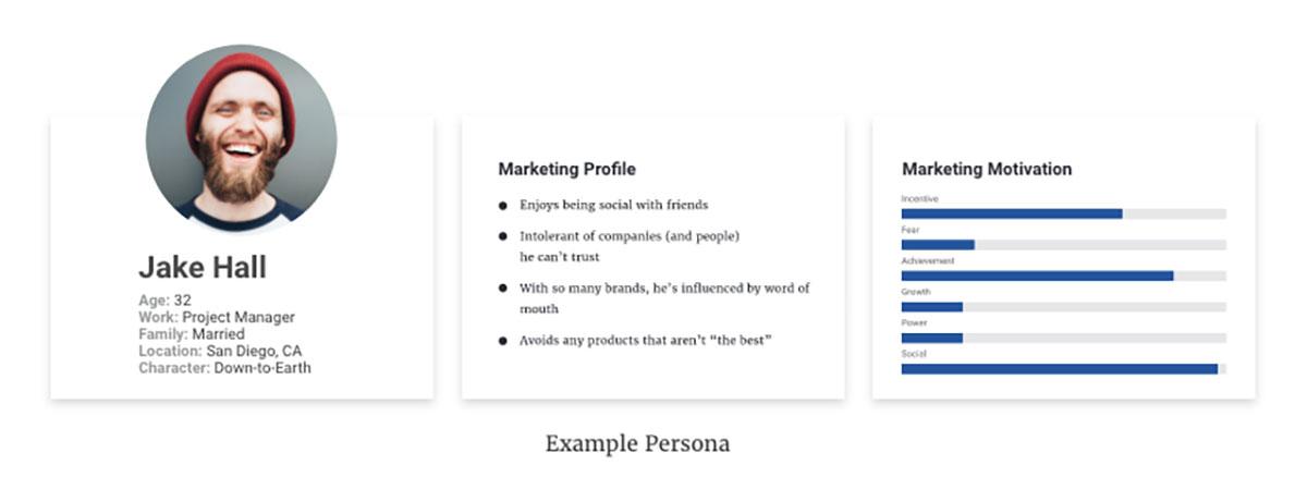
This is where it all begins. We create unique copy based on who our target audience is and the campaign objective. Through research, data analysis, and after a major brand exercise, we established the brand attributes, voice and personae.
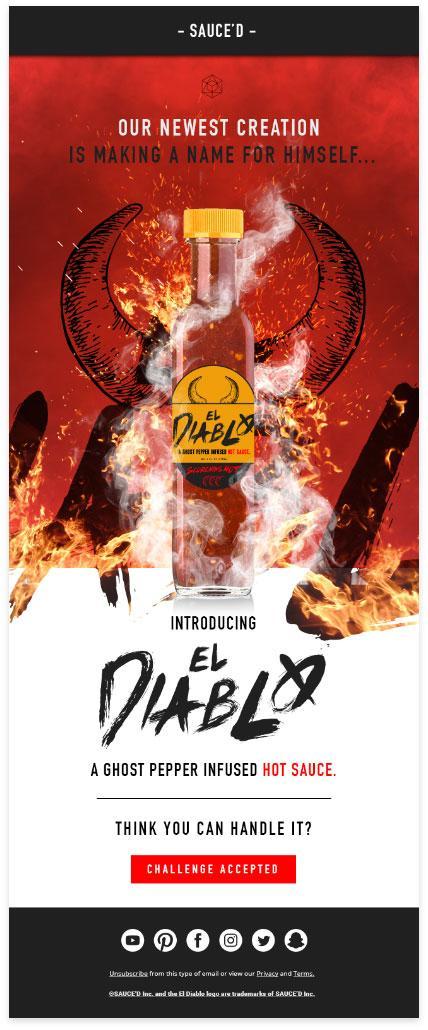
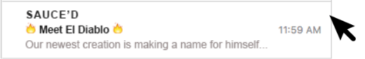
In this mock email example, we’re working with a fictional hot sauce company called “SAUCE’D” on the release of their new product “El Diablo” for the 25-45 year-old male market. We’ve identified that our target audience responds to confidence, authenticity and enjoys taking on social media food challenges. We’ll use this information to craft our tone of voice.
Layout
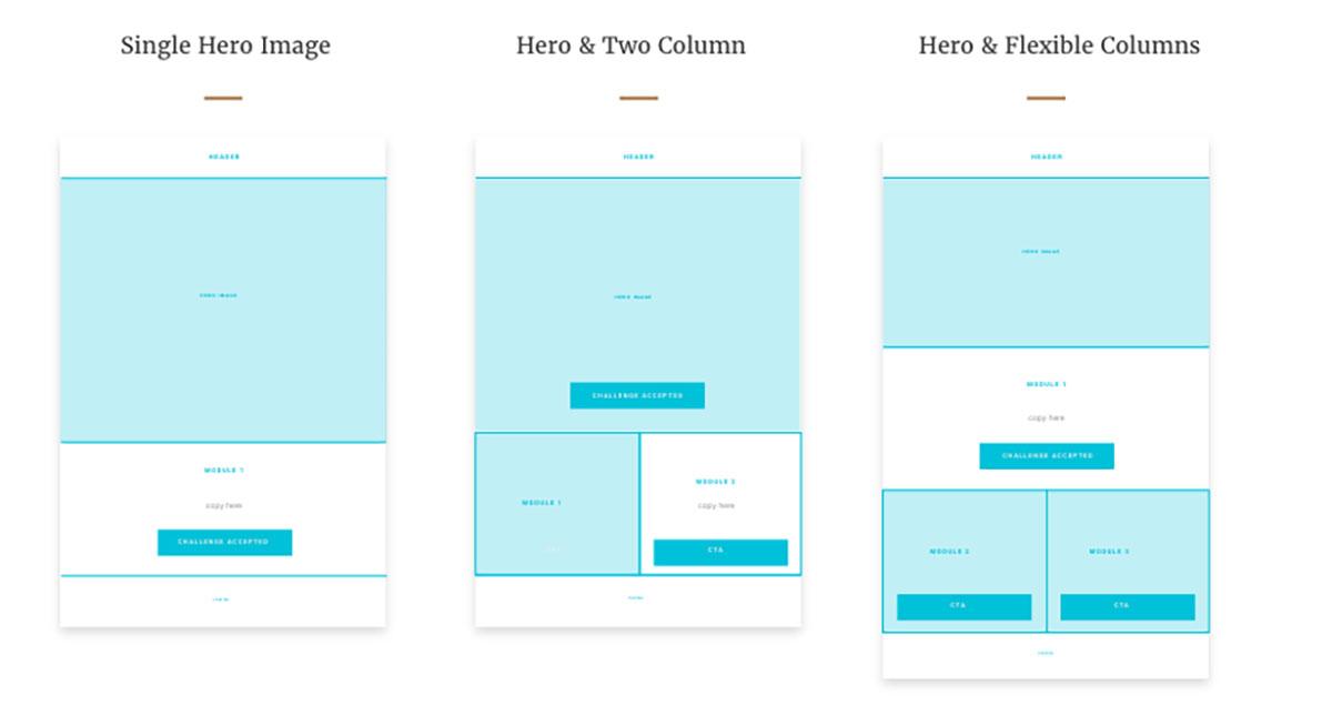
Next, the layout. After a meeting with the copywriter and performance marketing director, we establish clear campaign objectives to put into the brief. The questions we’re looking to ask are: What do we ultimately want people to do when they receive this email? Do we want them to buy our product from here? Do we want to get them to our landing page before converting? Will we need to incorporate recipes or promo codes in this email? We’ll want the email to be responsive and viewable on mobile so by knowing some of these questions, we’re able to structure our layout to accommodate the brand’s campaign objectives. (My copywriter said to add this: “Sometimes, copy changes after the copywriter sees it in the layout…..”)
In our campaign example, El Diablo’s brand manager wants to create awareness for the new product by having people take their hot sauce challenge. We decide that showcasing the product with a clear call to action “to accept the challenge” is the best solution to getting hot sauce in our target audience’s hands.
Creative
Adding the visual layer is the best part. How are we going to portray that this hot sauce is literally hotter than hell? It all comes alive through color, typography, imagery and composition. As marketers, we know that we only have a few seconds to grab their attention, and clearly communicate our product…so the visual has to stand out and read very quickly.
Color

We choose our colors based off the brand standards, market research and a competitive breakdown of our competitors. We’ll also want to portray this sauce is hotter than the devil himself hot, like really hot, like SCORCHING hot. To communicate this, we’ll be using different gradients of red with a slight vignette to create depth. We also want our audience to quickly get the key message, so we’ll use high contrast on certain words to create a focal point in our design.
Typography
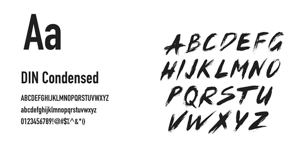
Type has the ability to convey emotion, and needs to reflect your product or brand. In this campaign, we want the typography to speak to the product but also connect the product to our brand (SAUCE’D). In this case, we need a font that will pair well with the brands san-serif font (DIN Condensed). Brush lettering was chosen to reinforce the feeling of movement (when you need to reach for the water after) and gives the type a hand-drawn authentic and unique feel for the product. By pairing the brands main font, and a unique font for the product, we’re able to create a cohesive message that is on brand and product.
Imagery
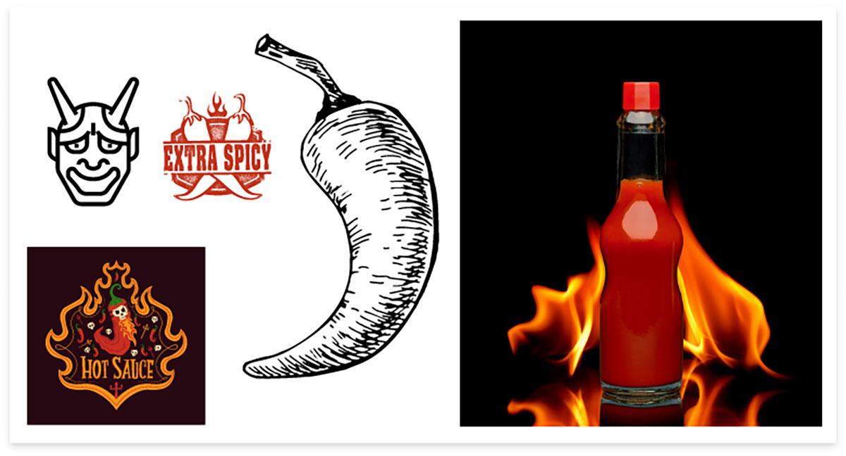
Imagery will be different, depending again on our audience and objective (again, reference the brief). It needs to be relevant and convey the emotion you’re going after. We are appealing to our target audience by conveying the taste of this product as HOT and challenging. By choosing to use fire, sparks and smoke we are conveying the temperature of our product visually to our audience. Damn! This is really hot sauce! We still want to convey our authentic feel, so an additional element of etched, stylized horns has been added behind the product to promote confidence and showcase the feeling of being blood red in the face when eating this sauce. Careful, product could make you rage…
Composition
We need our composition to flow very quickly and get right to the point. Our targets get hundreds of emails a day and scan quickly (yes, the subject line has to be exceptional, too and is often overlooked).
By using these strategic steps, we can craft visually appealing, effective email campaigns based on the cohesive objective from the brief. Bet you want some hot sauce now, eh?