
The Debate on Pantone’s Color of the Year
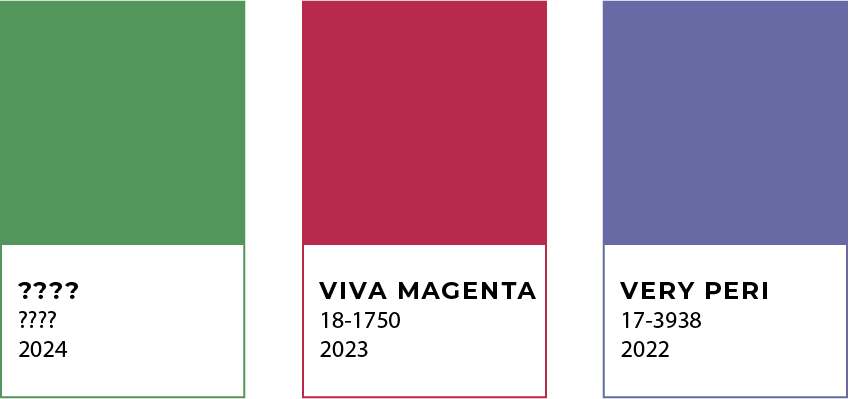
Most of us in the creative world are familiar with Pantone’s Color of the Year; a perennial attempt to create a symbolic relationship between color and culture that reflects the social climate of the time. You may also know this year’s selection is Viva Magenta – a tone one Wikipedia editor describes as “pinkish-purplish-red.” And while the color experts at Pantone believe it’s representative of inclusion, the debate over Viva Magenta has turned Modern Impact into a house divided.
According to Pantone’s announcement a few weeks ago, Viva Magenta is “an unconventional shade for an unconventional time; a new vision.” The company characterized their 2023 Color of the Year with adjectives like powerful, empowering, electrifying, boundaryless and audacious.
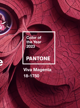
OK. Maybe. But is “boundaryless” even a word? Viva Magenta is also exactly half-way between red and blue on the Pantone color wheel. In my book that makes it more muddled, non-committal and undecided.
Based on the surprisingly passionate debate among our team at Modern Impact, I dug a little deeper and discovered other companies have found themselves just as torn over this latest Color of the Year (or COY).
As one New York Times staffer put it, “Viva Magenta might be the only color for 2023, a year that’s going to be all about divided government, divided everything. It’s neither here nor there, but it’s screamingly in-your face.” While another pointed out that “it’s also a compromise between red and blue. Which is maybe optimistic?”
Depending on your philosophical mindset – and personal style – Viva Magenta may be perfect for you. But love it or hate it, the real question for me is: What do I do with this color? Am I supposed to wear it? Design with it? Paint my house with it? Why have a color of the year at all?
I’ve always considered any “color of the year” less of an indication of new trends or attitudes, and more of a reflection of the previous year. By the time Pantone announces their COY, the trends and events it supposedly represents have often passed (or at least started to fade).
For me, the Pantone Color of the Year is almost predictable. Looking back at previous years, there is a pattern of warm and cool colors every other year. So, my prediction for 2024 will a cooler color – maybe a green hue of some sort.
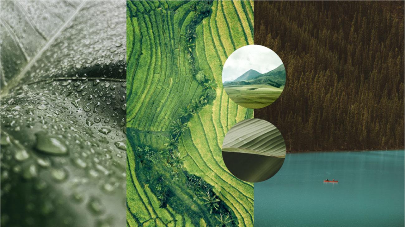
If 2023 continues to unfold as predicted, I think many people will find themselves pulling away from the confinement of the pandemic and getting back to the freedom of the outdoors, with a mindset of aspiration, growth, and harmony. I also think that the trend of “going green” and focusing on more sustainably products will continue to push forward. To me, that says “green.” (Maybe we should start a pool!)
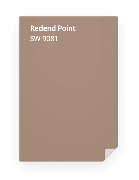
But, if I had to choose a formal “color of the year” to drive my design and feed my aspirations, it wouldn’t be from Pantone, but Sherwin-Williams (one of several other companies that have also started their own COY tradition). This year’s choice is Redend Point, which they describe as “minimal yet cozy, versatile, inviting and warming.”
And I agree. While being cooped up in our homes the past few years, many of us have done a little house project or two of our own. In my opinion, Redend Point pulls a neutral hue from nature that can make our spaces feel a little more organic by bringing a little of the outdoors in.
I believe there is an emerging movement in all design that’s leaning toward more neutral tones and natural textures – so Sherwin-Williams Color of the Year is in concert with that trend. I’m not sure if I’ll be using Redend Point specifically in my work this year, but I do believe leveraging it as a reference point and pulling in other neutral hues to create more minimalist designs will definitely be on-trend for 2023-24.
In the end, I’m not sure it really matters which Color of the Year you prefer. What does matter is the intent behind them and the focus they provide. Don’t want to pick a color? Then pick a word. Or a song. Pick anything that encapsulates the concepts that will help you pursue your goals, guide your decisions, and achieve new growth this year.
For me, Sherwin-Williams’ Redend Point sets a more practical standard for new design, while Pantone’s Viva Magenta provides a barometer of our collective social consciousness. I can be confident in saying I won’t be buying a new Viva Magenta bag and matching shoes. But I am definitely on board with pulling neutrals from nature while also being more mindful of Pantone’s emotional intent.
Maybe we can all channel some of that energy, empowerment, inclusivity and “boundarylessness” going into this new year – and beyond. Cheers!