
Top 3 Visual Design Elements of Branding
We talk about branding a lot in our business. But as much as we know about design and marketing, most brand discussions tend to turn nebulous. Everyone has their own spin on what makes up a brand, or what a brand identity should entail, or how brand guidelines should be maintained. I’ve read blogs and articles that say there are “4 key elements”, or “8 non-negotiable elements”, or “30 must-have elements” that a company needs to execute with perfection to have a complete and successful brand.
Today, I’m going to talk about my three favorites as a designer – the ones that are my must-haves and that I believe should complement other elements you include in your brand identity. And, while another key brand element is “tone of voice”, I believe these top three design elements are so important because they work together to visually translate and relay your brand voice – without saying a word.
Number 1: Your Logo
- Their business mission and goals
- The tone, personality and what they want to convey
- How to differentiate themselves from other like businesses
- Strive for simplicity and scalability
- Design in black and white first, then move to color
- Apply and test the logo in different mediums prior to finalizing
Number 2: Color Palette
The fun and my most favorite part! Choosing colors may seem like a simple task, but there is much more to it. The colors you choose for your brand should express your personality and your values – helping to visually represent that tone of voice you’re going for. Google is a great example of this. The color palette is very primary and playful – giving a simplistic and inviting feel to what is arguably the most complicated algorithm in the world. They want you to feel comfortable and unthreatened by the massive amount of information they’re about to serve you, and you do!
Below are color palettes to various popular brands. It’s fun to guess who is who, but it shows the importance of color and how certain brand colors have been embedded into our minds. (hint, hint: isn’t it wild how two tech giants are so similar in color palette?)

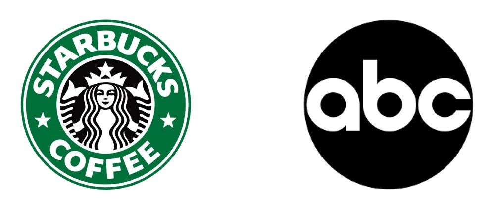
Color is SO important for some brands, they even trademark them. When you see that iconic green straw in an iced coffee, you know exactly where it came from. And, you know that brown truck driving around your neighborhood is delivering packages. Starbucks and UPS use color to tap into our emotional response and truly represent years of brand establishment. They’re part of our psyche. For more of Modern Impact’s take on how color psychology impacts brand identity, read our “Hue are You?” blog.
Number 3: Shape
For instance, logos with softer, round shapes tend to be seen as more friendly and approachable – less intimidating and more inviting than those with sharp corners. Round shapes are great for any business that wants to be approachable or even “consumed” – like coffee, news, soft drinks or social media.
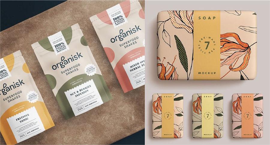
Not all brands need to have a standard shape. Organic shapes are great for expressing individualism and have a more natural, earthy feel – and they’re a great way to convey a softer more caregiving message. Organically shaped illustrations can effectively capture a product’s personality, ingredients or mission. Organic shapes can be a fun way to expand a brand throughout various materials, helping deliver a more holistic vibe.
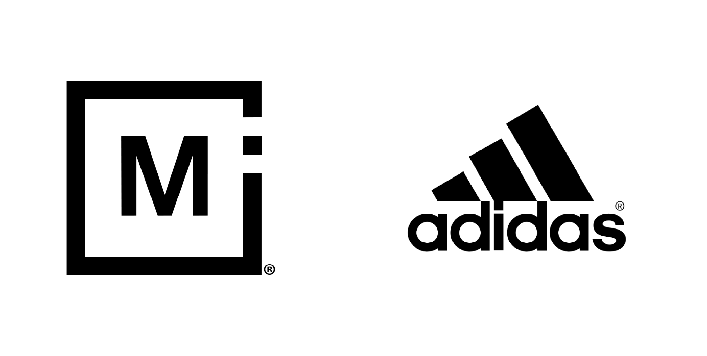
Sharp and angular shapes, on the other hand, are often used to communicate power, intelligence, maturity and technology. Squares convey solid, well-established values like Modern Impact’s logo below. Sharp, angular shapes can also convey strength and dependability. Looking at the Adidas logo you feel a sense of dependability in their product quality (one of their brand values) and feel you can tackle any physical activity that comes your way.
All in all, your logo, brand colors and shapes do some serious heavy lifting when it comes to visually expressing your brand values and setting the tone for your consumers. The time and investment you spend developing these assets will help you stand out against your competitors.