When it comes to design, less isn’t necessarily more
It seems like we’ve all ridden the wave of minimalism at some point in our lives, and it can be fun wave to ride. Simplifying. Cleaning up. Getting rid of excess. All good things and often necessary. I’m a big proponent of minimalism in many different areas of my life – from graphic design and architectural styles to how many toys and video games my kids can have.
But scrolling through X (Twitter) a while ago, I came across a thread that caught my attention entitled “The Danger of Minimalist Design (and the Death of Detail).” And as someone who has always been an advocate of modern, minimal design, I was intrigued.
One of the most interesting points in this comment-prompting thread may be when the author talks about the difference between, “capital M Minimalism – a conscious design movement – and small m minimalism, which has become the social default for seemingly every design choice, whether architectural or corporate or anything else.”
And while that post focuses more on architecture, I feel like the thoughts expressed are just as relevant to matters of graphic design and brand identity. So, I left the conversation asking myself, “Has minimalism gone too far?”
The answer, of course, all depends on who you ask and the medium in which they work. Different people have different styles and tastes – and there’s nothing wrong with that. It’s what makes life interesting and keeps the conversation going. But it seems to me, we’ve stripped all the uniqueness and character out of too many of things.
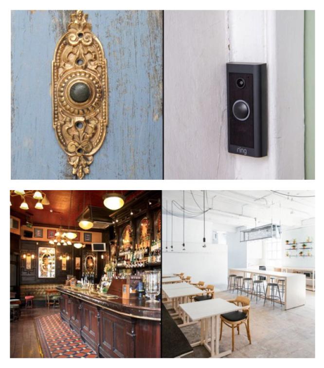
Just look around: Colors have been set aside in favor of blacks, whites and greys. Details and nuanced characteristics have been dumbed down in the name of “sleek and sophisticated.” Corporate logos are pushing the limit on how simple you can possibly make them.
As a designer, I get it. Companies looking to refresh their brands generally follow the trends of the day. But as a marketer, I also feel as though we’ve hit a point where minimalist design has lost its allure – and many brandmarks are beginning to blend in with those of their competitors.
In other words, the new brand “identities” of many companies aren’t telling us anything about who they really are. They’re bland, boring, uninspired and uninspiring, which defeats the very purpose of the work.
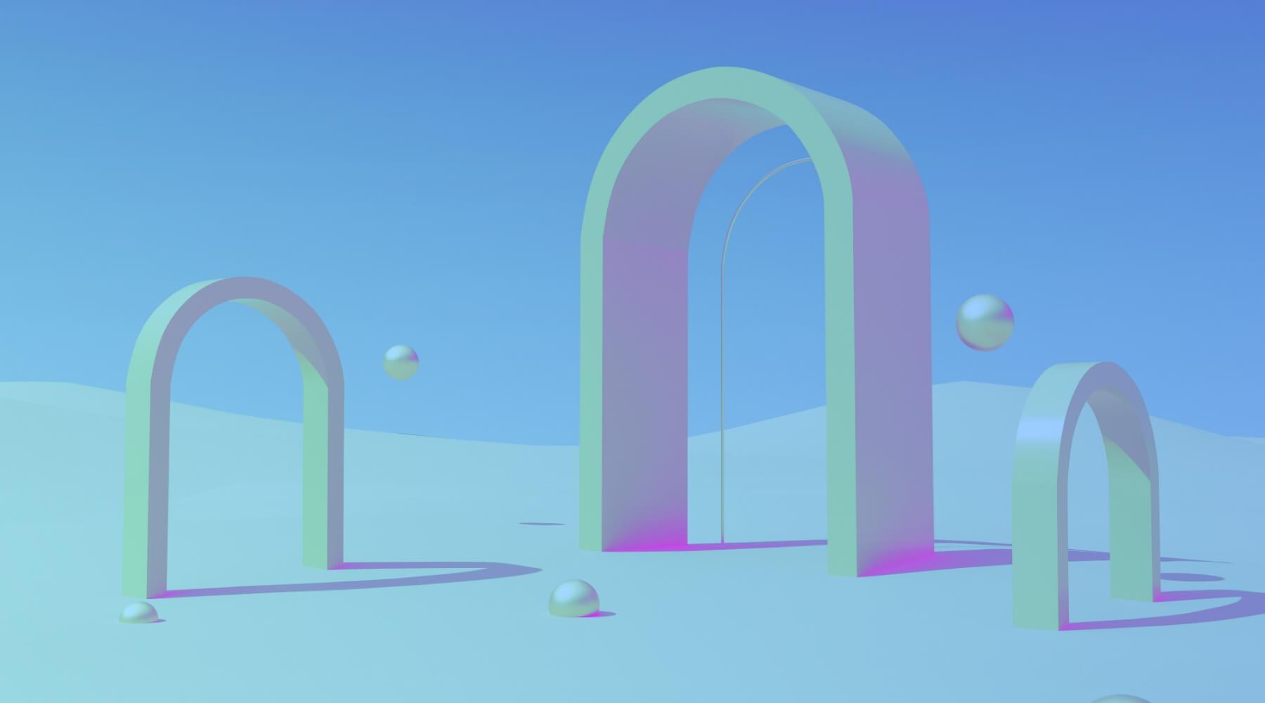
It’s time to bring more elements of “design” back into the craft of logo design. And there’s hope. This year has brought forth a few new, fun trends that suggest the pendulum is beginning to swing back toward work with real character and personality.
Modern Nostalgia
This trend showcases a fusion of vintage-inspired elements, encompassing typography, imagery, and patterns, all infused with a contemporary flair. The outcome is design that exudes a sense of nostalgia while simultaneously offering a breath of fresh air. I personally love playing around in this realm and am drawn to the blend of old and new.
Art by aiosection
Brutal Grunge
Chaotic and often overwhelming, grunge design is a lot of things, but boring in not one of them. One of my favorite things about this trend is the blending of colors and textures. I’m a fan of the hand-drawn elements and imperfections. Love it or hate it, you will definitely notice it.
Art by Nicky Laatz
Risoprint
I’ve always been a fan of the Risoprint or Risograph style of stencil printing. The stencil is laid into a drum filled with ink and then spun at high speeds to push ink onto paper. The use of vibrant colors and organic shapes results in fun, unique designs I love because the effect is simultaneously clean but rough. There is also beauty in the actual printing process because no two prints are exactly the same. You can also create the effect digitally if you want to avoid getting your hands dirty.
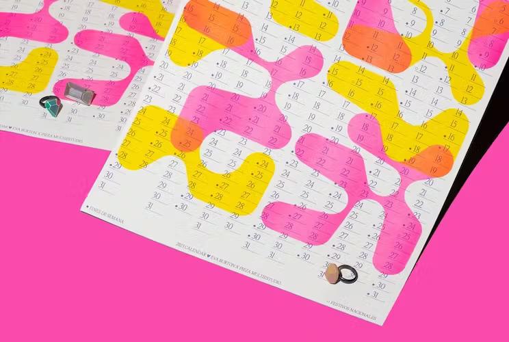
Art by Clara Briones Vedia
Overall, you can’t argue with some of the benefits of minimalism. Purposeful applications when done right can have a wonderful, lasting effect. In the case of brand identity, it can convey a sense of simplicity, approachability and user-friendliness.
But a default minimalist approach strips all the identity away, presenting a neutral image that expresses nothing and implies we’ve lost the ability to say anything at all.
As Modern Impact Creative Director, Dominic Friend, has said, “Instead of minimalism, we should be focusing on humanism. With the rise of automation (and resulting over-simplification), the pendulum needs to swing back to the value and preservation of the human element when it comes to design, art, and everything else.”
So, maybe – just maybe – we could stop taking the easy way out. Let’s challenge ourselves to create pieces with interest and recapture that stop-and-stare factor we seem to have lost in our attempts to streamline.
The true measure of art is the ability to engage and move the viewer, and while that may very well be accomplished through thoughtfully executed capital-M Minimalism, it’s not the only option. Let’s take a step back, take another look, and consider the cost of stripping away personality in the name of keeping up with the popular trends.